

Process
Competitive analysis
Extensive color creation and simulations
Usability testing
Internal stakeholder storytelling, persuasion, and guidance
Magnetic color system iterations
Documentation + implementation
Timeline
6 months
Role
Design lead
Outcome
Status colors distinguishable for 99.9% of population
First of its kind usability testing
Saving time and resources for maintenance of color blind modes
Background
As mentioned in Scalable color system, a big part of creating the system was thinking about usage.
Magnetic supports products used by security and networking admins that are primarily looking for alerts and anomalies within their organizations. This means that seeing the status (i.e. severity) of various items is of utmost importance.
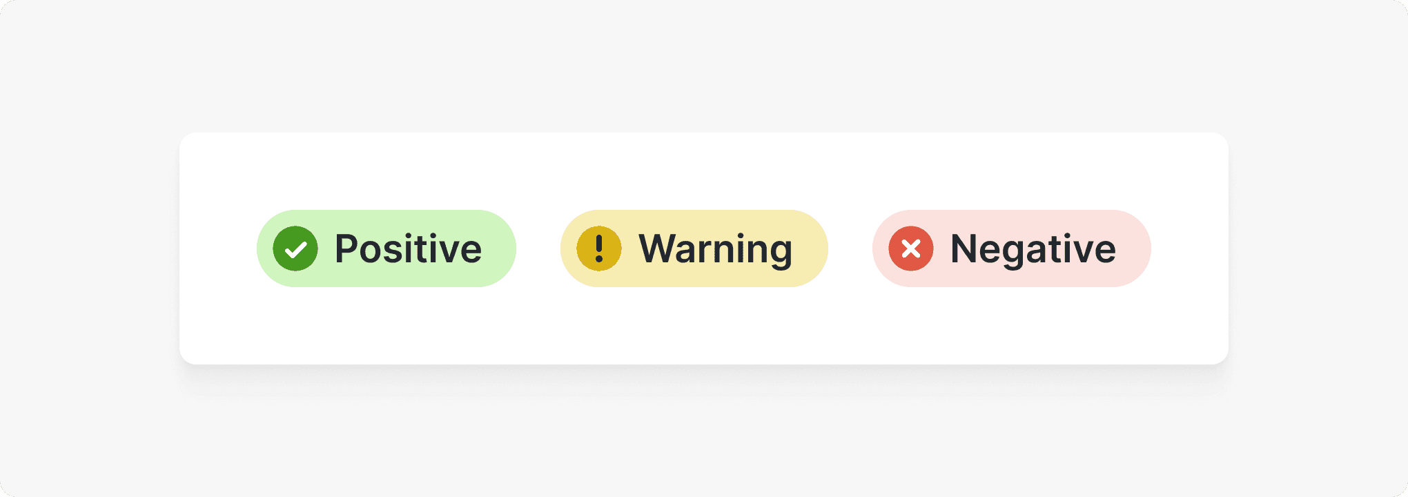
Magnetic’s previous default set of status colors followed the classic green, yellow, red traffic light model. These colors, however, posed accessibility issues.
The challenge
To create a set of research-backed status colors that would convey the intended sentiments while also being inclusive and accessible to all.
Status colors required a rethink for the following reasons:
👁️ Known accessibility issues
From customer complaints and using simulators, we knew that these colors posed an accessibility issue, particularly for users with red-green color blindness. Additionally, the yellow warning color did not pass 3:1 color contrast, so it would not be visible for users with low vision.
🔴 Overwhelmingly male user base, likely more color blindness
Users of Cisco products skew heavily male (for some user bases that is upwards of 90%) and 1 in 8 males have color blindness.
🌈 Only some products offered a color blind-friendly mode
Creating a default set of accessible status colors would be important as only some products offered a separate color blind-friendly mode (which poses other issues).
❗️ Status / severities are frequently used and of high impact
Ultimately, Cisco users need to be able to quickly find alerts and anomalies and then take action to remedy them. They rely on our products to make high impact decisions in regards to the security of their organization and users.

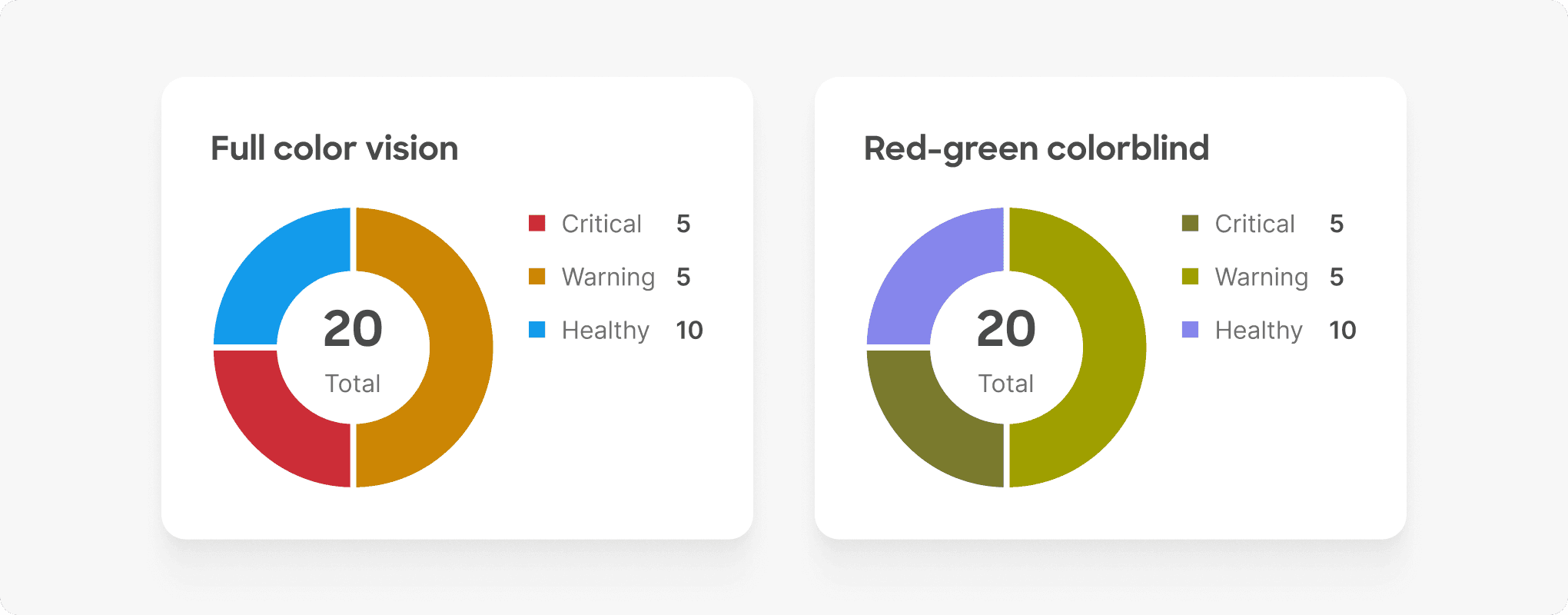
For users with the most common forms of color blindness, distinguishing between positive and negative elements was impossible. For users with low vision, the yellow was too light to see.
The solution
Following many rounds of design iterations throughout the color wheel and usability testing with a diverse set of users, we established a new, default set of status colors.
✅ The light blue positive color is distinguishable for all users
✅ The yellow warning color passes necessary color contrast
✅ The saturated negative red color is easy to spot
✅ The light blue positive color though not conferring the same positiveness as green still conveys “things are okay” or “complete”
✅ In line with adaptive theming, Magnetic supports the classic green, yellow, red status colors that products can offer to their users
The new set of status colors is more inclusive and distinguishable for all users. Additionally, the new light blue positive color makes it easier to spot warnings and alerts.
The process: usability testing
Choosing status colors for use in UI is often a subjective decision where designers go with an option that feels right, to their eyes.
Even when designing inclusively, such as using the best vision simulators, it’s not possible to truly understand the diverse reality of what real people see. We therefore wanted to test status colors with a diverse set of people to understand how they see and assign meaning to them in order to ultimately provide guidance on what might be the best set of default status colors for Magnetic.
The color sets
The original Magnetic status colors were tested against 3 other options. These options were carefully created for the following reasons:
Color contrast
All colors needed to pass 3:1 color contrast against white per WCAGOrange instead of yellow
The orange warning color was used because yellow is nearly impossible to make visually appealing AND pass 3:1Saturation differences
We wanted to see how saturation, particularly between the negative and positive colors, could impact the ability to distinguish the twoMoving along the color wheel
In vision simulators, as you shift from a classic green towards blue, the more differentiated it becomes for those with color blindness
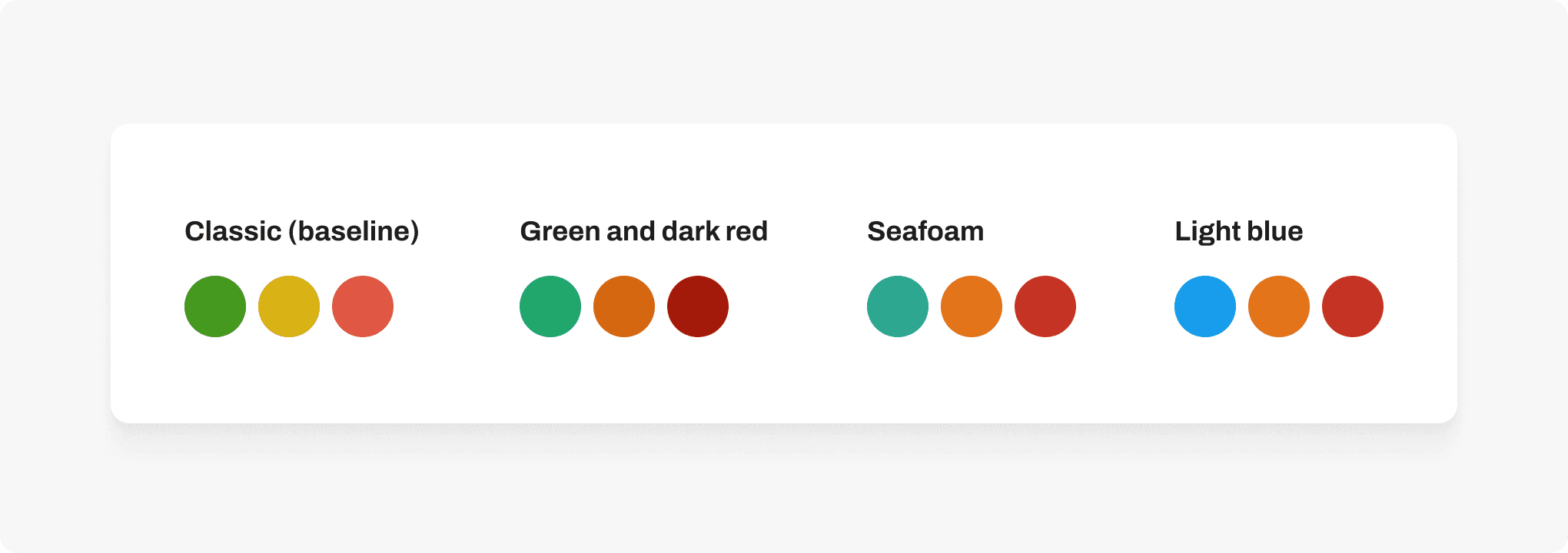
The existing Magnetic status colors served as a baseline against which we tested 3 other sets of status colors that were carefully chosen.
The testers
The user research involved a diverse set of 13 testers including Cisco users and other testers who worked in the tech industry.
5 with full color vision
5 with partial red-green color blindness
2 with severe red-green color blindness
1 with partial blue-yellow color blindness
The test
Testers interacted with 4 data visualizations and 1 UI pattern from Magnetic and finished by giving overall feedback on the 4 swatches.

- Usability tester with mild red-green color blindness responding to the UI pattern with the light blue status color set
Finding highlight
The original status color set had the lowest success rate in regards to distinguishability between the positive color from the other colors.
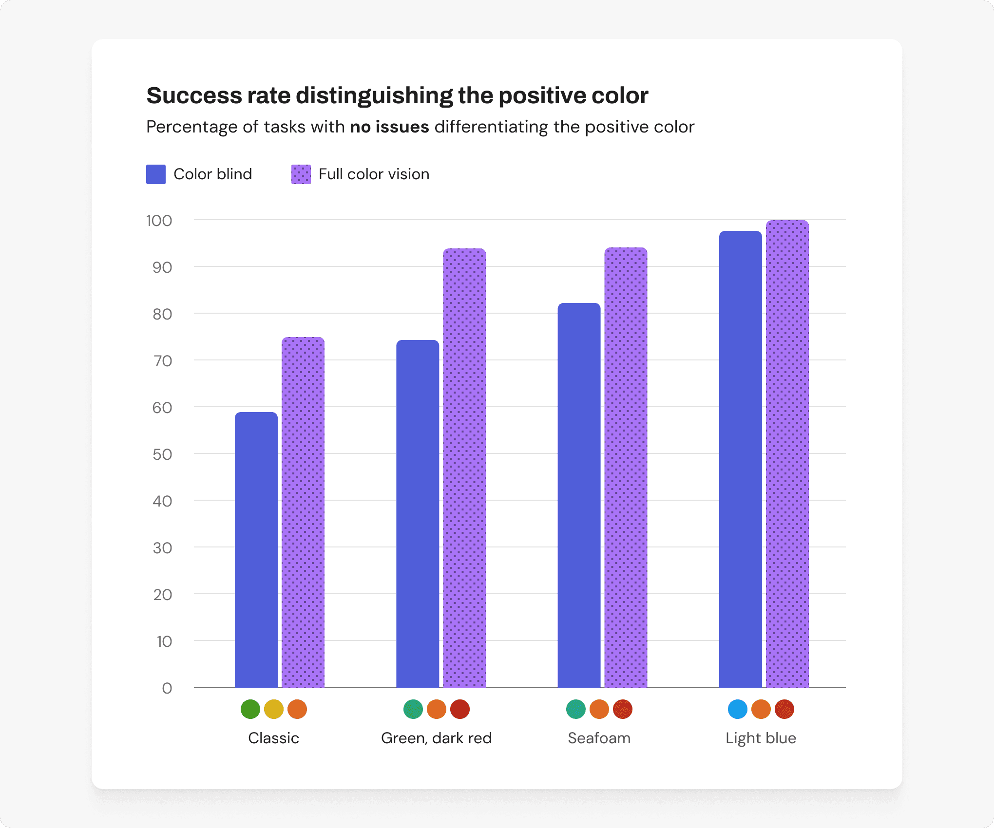





Research-backed status colors
Based on the research findings, I used the Magnetic color system to create Magnetic’s default status colors.

An example Magnetic template showcasing the status colors in action.
Adaptive theming
In alignment with Magnetic’s accessibility principles, we default to the theme that is most accessible for all users while also giving the flexibility for users to switch to the theme they prefer.
Thus, Magnetic still offers themes that have the classic status colors for users that prefer these options.

Key challenges and learnings
This project taught me so much and doing the actual color work and testing was only about 15% of it.
Status quo bias: “Green means go!”
For most people in the Western world, we’ve been ingrained from an early age in the traffic light model: green means “go”, yellow means “caution”, and red means “stop.” Despite ample evidence supporting a more inclusive direction for our default status colors, we faced significant initial push back from internal stakeholders before getting the green light (pun intended).
It was a fascinating look into human psychology: When people are shown something that doesn’t align with what they have been so used to, it can almost becomes a mission to try to disprove new evidence to protect these underlying beliefs.
How did we get past it? It was a combination of efforts, including:
Storytelling through clips from our usability testing, Cisco’s mission of “creating an inclusive future for all,” and showing examples across the industry of other products equating blue to positive
Executive buy-in that default must be the most accessible
Adaptive theming: The updated status colors as the default, but not the only option for users to pick from
The power of storytelling, lead with choices
A flaw in the way we originally presented this work was that we discussed the updated status colors as the new and only set of status colors rather than the default set.
This may seem like a subtle but rather than leaning into the idea of “default as the most accessible” and allowing users to select a theme that works best for them (adaptive theming), stakeholders felt stuck when locked into a singular option. Only once we introduced the idea of user choice, did the wall and friction fade away.
Outcome
The updated status colors have been the default in Magnetic and in products that use Magnetic for ~1.5 years as of this writing (Mar 2025).
Feedback
While we don’t have quantitative data on how this change has been received, we have had qualitative feedback that shows that for users will full color vision this has been an easy (and mostly unnoticed change), while for users with color blindness, this update has been a huge improvement over the previous status colors and over color blind modes that often went neglected.
Improving the lives of ~132,000 users
Regarding color blind mode, we did have data from one product that had offered a separate, rarely used color blind mode.
This product has 2 million users, 90% of which are male. With 1 in 8 males and 1 in 200 females having color blindness, we would expect ~145,000 of their users to have some form of color blindness.
However, their data showed that only 12,600 of their users were using color blind mode. This means that ~132,400 of their users were getting a degraded experience, where it was nearly impossible to distinguish positive and negative elements.
With the updated status colors, these 132,400 users now can easily make use of the default product and this product no longer has to maintain a separate color blind mode.
Special shoutouts —
Though I led the creation of the colors, I had the pleasure of working with several key people on this eye-opening project.
Accessibility expert, collaborator on analysis of usability tests
UX researcher, deftly guiding testers through these tests
Color feedback
Beyond status
With status colors set in Magnetic, let’s take a look at how we then approached creating an agnostic set of categorical charting colors.