
Categorical colors for data visualizations

Process
Constraint analysis
Competitive analysis
Brand considerations
Design explorations and feedback
Testing with tools and simulators
Internal stakeholder presentations
Documentation + implementation
Timeline
4 months
Role
Design lead
Outcome
Accessible, on brand set of categorical colors to help convey chart insights
First 5 colors distinguishable for 99.9% of the population
Supports up to 12 categories
Background
Categorical colors are used when creating a chart or graph that is meant to display various categories of data. Each category is represented by a different color, making it easier for the user to understand the information.
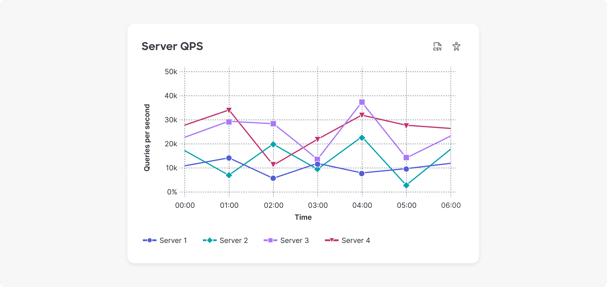
Categorical colors are used to represent individual comparisons without inherent ordering.
Considerations and requirements
In addition to charts and graphs representing status, Cisco products also feature data visualizations that represent categories without the intention of conveying a sentiment or severity.
The previous color system had limitations in terms of its charting colors, and thus we set out to create a new set of visually beautiful and accessible categorical colors with the following requirements:
12 colors in light and dark modes
We need to support both light and dark modes and charts that have up to 12 categories.
3:1 color contrast
Colors must pass 3:1 color contrast against the background (white in light mode, a near black in dark mode).
Visually distinguishable
For users with full color vision, all 12 colors should be discernible from one another, even in thin line charts. For users with color blindness, we aimed for the first 5 colors to be distinguishable.
Color combinations don’t convey an implicit, emotional meaning
Unlike status colors, categorical colors are not meant to convey a certain sentiment (e.g. good or bad). The colors should aid in communicating the intended story in data visualizations.
Harmonizes with Cisco brand
Brand colors are not meant to be used in charts, but we did want our charting colors to harmonize and embody Cisco’s brand.
The solution
These 24 colors (12 for light mode and 12 for dark mode) were carefully chosen from the Magnetic color system, mapping back to our core considerations and requirements. We balanced visual attractiveness, distinguishability, accessibility, and considerations for Cisco brand.

The order of these colors is important, as they are intended to be used following this sequence for visual and accessibility reasons.
The process
Categorical colors are not as high impact as status colors, in terms of potential harmful decisions being made, so for the creation of these I relied on a combination of testing via various tools and simulators, internal design feedback, and ensuring we were “on brand.”
Understanding constraints
The easy-to-apply rules from the color system allowed us to know at a glance what colors could be considered for use in charts. For example, in light mode, any color 60-level and darker passes 3:1 on white and therefore from a contrast perspective, could be used in charts.

Considering brand
While we wouldn’t be using Cisco brand colors in charts, we did want to consider brand. As data visualization expert Gabrielle Merite states, “Develop data visualization-specific color palettes. They can harmonize with your brand colors but can depart from their exact tints & shades.”
This meant ensuring they properly conveyed Cisco’s brand personality while infusing brand where possible.

The first categorical color (Lavender-45) in the sequence gets used most commonly and is a close synthesis of Cisco’s three main blue colors with slight tweaks to make it work in a UI.
Visual strategy of alternating lightness
We considered both aesthetics (in terms of how colors look when they are right next to each other) and accessibility (in terms of how distinguishable the colors are).
This was done by using the rules of our color system and considering the lightness of the colors, mostly alternating between lighter and dark colors for visual separation.

In dark mode, in order to pass 3:1 on this near black background, the darkest possible shade to use is lightness of 50. As underlying research for APCA shows, there are issues with the way WCAG currently measures contrast on dark backgrounds, so we bumped the darker shades up to use the lightness level of 55 for better usability.
Testing using the best in class tools and simulators
In order for categorical colors to be able to convey their message, users need to be able to tell the difference between colors, even when used in thin line charts.
Every person’s vision is unique, so in addition to using my own and getting feedback from other designers, I utilized the following three tools to help ensure that our categorical colors are sufficiently distinguishable from one another.
Viz Palette
Well-respected tool in the data viz community for ensuring color differentiation. Uses a methodology based on Just Noticeable Difference (JND)
Leonardo
Another tool for measuring how different two colors are. Helpful to compare with Viz Palette since it relies on a different methodology for measuring color differentiation (Delta E).
DaltonLens
One of the most accurate (and free) color blindness simulators.

Tools like Viz Palette helped to test and ensure that all 12 categorical colors would be distinguishable for those with full color vision, while the first 5 (the most commonly used) would be distinguishable for those with color blindness.

I also wanted to ensure color differentiation between the most common categorical colors and the status colors for scenarios like the one above. For DeltaE (ΔE), when two colors have a ΔE of 11 or greater, that is considered to be sufficiently differentiated.
Balancing aesthetics and accessbility
We wanted to ensure that the colors looked visually appealing to those with full color vision while also inclusive to those with various forms of color blindness. This meant thinking of usage. Most charts have a maximum of 4-5 categories and commonly 1-3, which means the first 5 colors of the categorical palette will be seen most frequently by users.
It’s not possible to create a set of 12 categorical colors that are distinguishable for users with color blindness, so we wanted to ensure that at minimum, the first 5, most commonly used colors would be.

Simulations for common forms of color blindness using DaltonLens show that the first 5 categorical colors are sufficiently differentiated.
Outcome
The overhaul of the categorical colors provided our design system with what we needed: an accessible set of colors for light and dark modes that help even the most complex of charts convey their intentions.
Recently, the charting colors have been instrumental in helping with a visual overhaul of our charting library. With our color system powering it, we easily introduced more visual flair, like the addition of subtle gradients, all while still being accessible.

Overall reflections on color, color systems, and accessibility
A few takeaways from all my work on color, including categorical colors.
Rely on great work done by those before you
There is a plethora of useful tools and proven systems for creating, simulating and testing colors.
Test with users
When possible, like most things in UX, test with users, ideally including a diverse set.
Think about how colors will be applied
Colors shouldn’t be created in a vacuum and instead the real challenge is creating accessible ways that colors are applied and combined while molding the color system to support that.
Create flexibility (adaptiveness)
When possible, default to the most accessible but allow users to choose based on what works best for them.
WCAG is just the starting point
Just because something passes minimum WCAG requirements does not mean it’s usable.
Special shoutouts —
Though I led the categorical color project I always have help from my teammates to help iterate and get it across the finish line.
Accessibility expert, additional color blind simulation testing
Product designer, “design zhooshing” of the updated charting library
Product designer, leading the revamp of the charting library
Magnetic team lead, collaborator helping to create the story around the charting colors
Color feedback
Implementing it all
Status colors. Categorical colors. Light mode. Dark mode. How does this all get implemented and managed? Let’s explore that next.