
Theming

Timeline
6 months
Core team and role
Me • Design lead
Jesse Clark • Technical lead
Edvard Gezin • Design collaborator
Lindsey Titus • Eng partner
Outcome
8 Magnetic themes, powered by our color tokens
Color tokens applied to 100% of our components, allowing for seamless theme switching
Allows users to choose the theme of their choice
Sets path for future themes, such as various info densities
Background
Since it’s origination, Magnetic had supported one theme that was geared towards supporting one product. As Magnetic has scaled to now supporting 60+ products, we needed a way to support multiple color themes. This included:
Light and dark modes
The new, accessible status colors and the classic status colors
A default brand accent color and an alternate brand accent
In short, we needed a way to easily implement and maintain all of the work that went into updating and applying the color system.
Color tokens
Color tokens are a type of design tokens. Because color was the only initial element changing between themes, it was the first design token we started with.
I like to think of design tokens as an abstracted away container for a primitive, foundational element (e.g. a color of Lavender-45 or 4px for spacing). This container refers to the primitives, in order to dynamically change the color scheme for products or pages depending on theme chosen. So while the color palette provides the potential colors that a color token can refer to, color tokens are what get used in components, text, and all other elements on a page to enable theming changes.
For example, in Magnetic, the Negative icon uses the design token negative.icon.default. In light mode this refers to red-45, while in dark mode this refers to red-60.

Workshopping the color token structure
One of the hardest things about working on tokens is creating a naming system and structure that makes semantic sense to the designers and devs who will use it, is able to grow or contract, and can support needs without having unnecessary bloat.
Together with my colleagues on a scrappy token team, we held a series of workshops to evaluate naming and structures for color tokens, stress testing them versus our component needs.
Ultimately, we moved forward with a sentiment-based color token system originally created by the Asana design team.
Implementing color tokens
Next was working to figure out the detailed use of these color tokens in our components.
Token mapping
With the basics of the naming structure in place, I worked with Ed (a fellow Magnetic designer) to map in Figma, exactly how and where these color tokens would be applied to our components, bringing anomalies back to our token team for discussion and iteration.

Example from the mapping exercise of what color tokens the Select component would use.
Designing dark mode
Concurrently, Ed and I began to design Magnetic’s dark mode. This was again where the color system and easy-to-use rules came in handy, as we were first designing just using color system primitive colors while we figuring out the token structure.

Color styles, then eventually Figma variables
In our first implementation of this work, we had to rely on color styles in Figma to represent our color tokens and synced those values to code using a 3rd-party plugin called Tokens Studio. This process, however was quite tedious and required us to maintain an external theme file for every theme.
Once Figma released variables, we began testing that and eventually made the full migration to managing Figma variables in June 2024. In that process, we worked to back our styles with variables to ensure no breaking changes.
With the switch to variables, switching between themes became exponentially easier for our users.

With the switch to Figma variables, all themes are in one file allowing users to easily switch a page, frame, or component to a given theme.
Education
What I quickly realized about tokens is they are not something easy for many designers to intuitively grasp, especially after being accustomed to using primitive colors like “Blue-45” for buttons or “Neutral-15” for primary text. In addition, with the subsequent migration to Figma variables which would change how they would swap themes, I thought "how might we create education to help with these transitions?"
Documentation
Of course, for most design systems the first place to start is documentation. With the updated color system, status colors, and categorical colors, along now with the introduction of color tokens, I did a full overhaul of the Colors section on the Magnetic website.

Quick checklists
However, many designers don’t have the time to read through robust documentation. Ed and I created a couple checklists that designers could use right in Figma, which highlighted the most commonly used color tokens and helped with the transition to color tokens.

Ask Us Anything
Ed and I ran a series of Ask Us Anything where designers could ask anything regarding tokens and swapping themes.

Short videos
I recorded a set of short, 1-2 minute Loom-like videos for the Magnetic website and support channels that act as quick guides for designers on a variety of topics related to tokens, choosing themes, and switching themes. These serve as everlasting material that still get shared today.
Outcome
The implementation of color tokens and the migration from Figma styles to Figma variables provide:
Ease of use
For Magnetic consumers, they can seamlessly swap themes, designing in their theme of choice.
Time
For our team, tokens and variables have enabled a significant reduction in time and resources needed to maintain multiple themes and modes.
Agility
We are able to easily make system-wide updates or create new themes as needed (e.g. in the case of a Cisco product acquisition.)
Designers and developers can now easily use 8 themes supported by Magnetic. These include:
Default themes
Light and dark themes using the updated, inclusive status colors
Classic status colors
Light and dark themes using the classic, traffic light status colors
Brand accents
Two options: Themes that use either the default green accent color or an alternate blue accent color
Switching between the 8 themes supported by Magnetic
Challenges and key learnings
Colors were my first foray into design tokens, and so I learned many things along the way that I am taking with me as we expand our token system beyond colors to think about spacing (and more in the future).
Measure twice, cut once
Naming structures and the framework need to be deeply thought through and ideally stress tested by your users, because once out in the wild, changing a token structure or removing tokens can cause major breaking changes.
Start simple, wait to layer on complexity
For any design tokens, but particularly with color, these can become bloated and overly complex quickly. While our color token system works well and covers almost any use case for new components that come into the system, we do have unused tokens. What I wished we did was only create tokens as needed, to prevent bloat and also because adding tokens is a lot easier than removing them.
Collaborate to create
Design tokens provide a shared language between designers and developers. However, the mental model of tokens skews more closely with engineering, so it’s important to have both sides at the table when creating a token framework and naming structure. Now, I’m always thinking of the designer who is just onboarding onto Magnetic and has no idea what a design token even is and how we can make this as easy as possible for them.
Onward
At the beginning of 2025, in order to support multiple densities and responsiveness, I have begun leading a project on spacing tokens.
Though the color tokens project has gone relatively smoothly, I have learned from that project to do some things differently by:
Conducting an audit of 15+ other publicly available spacing systems
Reaching out to others in Cisco and the broader design system community for their approach and advice
Testing early spacing ideas and getting feedback from designers to help iterate on our structure and naming system
Leading out the gate with a lean spacing token system
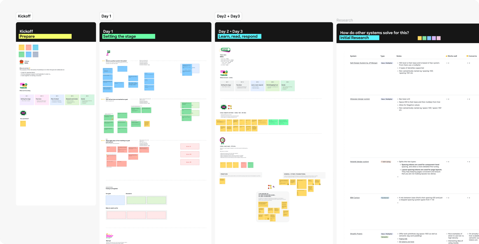
I started the spacing token project by leading the token team through a series of mini-workshops to level set on all things spacing tokens.
Slides from a presentation to the Magnetic Design Team giving a primer on the impact and importance of spacing tokens.
Special shoutouts —
Though my engineering colleague, Jesse Clark and I largely lead the implementation and roll-outs of themes and tokens on the engineering and design side respectively, we have a small, but gritty token team of cross-organizational colleagues that we jam with weekly on all things tokens related.
Technical lead, my dev partner for managing and implementing tokens and themes
Engineering partner, led dev efforts for the transition to Figma variables
Senior Designer, fellow Magnetic designer and collaborator
Senior Design Systems Engineer, Meraki
UI Engineer, Splunk
Senior Design Systems Engineer, Meraki